

Why Are We So Afraid of Color?
An Unapologetic Opening: Why Color Matters
You might not agree with what I’m about to say. You might even dislike it. But as artists, our job is not to please — it’s to challenge the norm. So read this with an open, truthful mind. And if you’re living in a muted space, this article is for you.
This is a challenge, a call to question whether you truly love the space you inhabit. Do you have an accent color? When you walk into your room, pay attention: where do your eyes go? What feeling stirs in your chest? If your gaze finds that single accent wall or throw pillow and you feel a small spark of joy, then ask yourself: why only there? Why contain what makes you smile?
When you travel to other countries, notice how colors shape your mood. Cities painted in cobalt, streets lined with vibrant textiles, markets exploding with saffron, indigo, and scarlet — they awaken something in us. They remind us that color is life.
And yes, I want to touch on politics, because that’s what creatives do — we challenge. Perhaps the reason we are being herded into a neutral, beige world is no accident. A muted society is easier to manage, easier to pacify. Keep us colorless and we’re easier to corral into subservience. We become obedient consumers, dulled into believing that the answers lie in the hands of those who profit from our conformity. But it’s a farce.
Painting your wall a wild, unapologetic color may not start a revolution. But it will start something inside you. It will remind you that you are more than a cog in the drone-like daily grind. It will feed the spark of individuality that conformity tries to smother.
For those who rent, I hear you. Maybe painting your walls isn’t an option. But that doesn’t mean your space has to stay muted. Fill your walls with large, unapologetically colorful art, bring in or paint furniture in bold shades, and layer in textiles and textures that radiate life. Even if it’s temporary, let your space vibrate with energy and personality. And to landlords — what’s the big deal? A few extra coats of paint? Is that really more important than the quality of life of the people who live there?
We don’t just need color back in our lives. We have to bring it back.
Nature as the First Teacher of Color
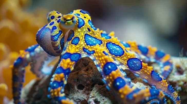
This stunning image captures the mesmerizing beauty of a blue-ringed octopus in its natural habitat. The octopus's vibrant blue rings contrast sharply against its yellow body, creating a dazzling display of color. Known for their toxic venom, these creatures are as dangerous as they are beautiful, navigating the complex ecosystem of the coral reef with grace and agility.
Image courtesy of Stockcake (https://stockcake.com)
Nature doesn’t shy away from color.
A tiger’s stripes, a bird of paradise’s plumage, the warning reds and yellows of poisonous frogs—all of these hues serve a purpose. Neutral tones in the animal world often mean camouflage and survival. Vibrant tones, on the other hand, shout warnings, signal dominance, or simply stand out from their environment.
Camouflage vs. Vibrancy in the Animal Kingdom
Neutral colors are a shield — camouflage for prey, invisibility for hunters. Bright hues, on the other hand, are survival signals: stay away, I’m poisonous, or I am stronger than you think.
The Octopus: Master of Color and Communication
Of all animals, the octopus may be the greatest color artist. With specialized cells called chromatophores, it can shift its skin tone in an instant — melting into sand to hide from predators or pulsing with flashing reds, blues, and whites to warn, court, or confuse. It doesn’t just survive with color; it communicates with it. The octopus is living proof that color is a language, one that transcends words.
If the octopus can speak through color, what are we saying when we strip it away from our homes, clothes, and lives?
How Color Shapes the Animal Brain

Take a moment to sit with these colors. Let your eyes rest on each swatch and notice what emotions they stir — does red feel urgent, does green soothe, does blue steady you, or do you sense something else entirely? These hues are invitations to reflect: energy, calm, caution, mystery, renewal. If your experience diverges from the words here, that’s the beauty of color — it’s deeply personal. Share in the comments below where your feelings align or differ.
© Bedouin Dreams 2025
Color is not just decoration — it’s biology. It works on us the way it works on animals, triggering instinctive reactions tied to survival.
Red – Fire, blood, ripe fruit. Red raises our heart rate, signaling danger or passion. No wonder stop signs, warning labels, and fast-food chains rely on it. Red demands to be noticed.
Orange – Warmth, firelight, harvest. Orange stimulates appetite and social interaction. In animals, it’s both attraction and warning.
Yellow – The color of the sun. Joyful, radiant, but also dangerous in nature when paired with black (think hornets). It’s optimism laced with caution.
Green – Growth, abundance, renewal. Green calms the nervous system; it tells the brain there is food, water, safety here. That’s why nature restores us.
Blue – Sky and ocean. Rare in nature, yet universally loved. It lowers blood pressure and instills trust. In animals, it’s often a rare, status-driven display.
Purple – Rarity, transformation, mystery. Historically reserved for royalty. In nature, a flower blooming purple is an exotic signal of attraction.
Black – Power, mystery, fear. Black animals are often predators — or mimics of predators. Humans read it as both elegance and intimidation.
White – Purity and sterility, but also emptiness. In animals, white fur signals vulnerability. In human spaces, white walls signal control.
Beige, Brown, Grey – Camouflage. Safety through invisibility. In animals, it means survival. For us, it’s retreat.
When we mute our environments, we’re behaving like prey animals — hiding. When we use vibrant colors, we’re declaring: I am here. I am alive. I am unafraid to be seen.
A Moment at the Paint Counter
When I bought my first home—right before the pandemic—I went to the local paint store with my swatches: purple, bubblegum pink, turquoise, yellow, and orange. At the counter, I noticed a woman staring at my selections while holding her own stack of muted neutrals.
She asked if I was really painting my walls those colors.
I laughed. “Absolutely. It’s just paint, but bright colors make me happy.”
She paused, then confessed she didn’t truly want the safe shades she had chosen. There was a bold color she loved but felt hesitant about. Maybe she was thinking about resale value or what magazines define as “elegant.”
I told her what I believe: at the end of the day, it’s just paint. If it makes you happy, why not live in color?
She stood there for a moment, flipping through her swatches, weighing the choice between blending in or standing out. Then she smiled. “You know what? I’m going to do it. Why not?” She put the neutrals back on the counter and walked away with the colors she truly loved.
That moment has stayed with me. One decision, one burst of courage, one small act of rebellion against beige.
Cultures That Live in Color
Travel the globe and you’ll quickly see that some communities embrace color not just as decoration, but as language, history, and identity. Walk through these places and you don’t just see the hues — you feel them. They shape mood, invite connection, and carry stories across generations. Each is a reminder that color is far more than surface-level beauty; it’s spirit painted into daily life.
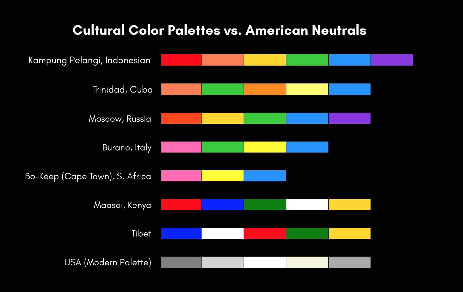
This graph highlights how cultures across the globe embrace vibrant color — contrasted with the muted palette dominant in the U.S. What stands out to you?
© Bedouin Dreams 2025
Tibet: Prayer flags ripple in primary colors, each representing an element — blue for sky, white for air, red for fire, green for water, yellow for earth.
Color meaning: Harmony with nature and a reminder of life’s interconnectedness.The Maasai of Kenya and Tanzania: Dressed in red shukas, they wear color as protection, strength, and cultural pride. Their beadwork is a full color language — blues for energy, greens for land, whites for purity, yellows for fertility.
Color meaning: Strength, community, and identity worn proudly and publicly.Trinidad, Cuba: A UNESCO World Heritage Site renowned for its pastel-hued colonial architecture, Trinidad radiates joy down its cobblestone streets. Buildings painted in corals, lime greens, pumpkin orange, sun-bleached yellows, and cobalt blue lift the spirit and preserve a frozen-in-time Caribbean vibrancy.
Color meaning: Celebration of heritage and the preservation of cultural joy.Cape Town, South Africa: In the Bo-Kaap neighborhood, freed slaves once painted their homes in bright pinks, yellows, and blues as an act of celebration and identity. What was once a symbol of resistance to oppression has become one of the most iconic cultural landmarks in South Africa.
Color meaning: Freedom reclaimed through self-expression.Burano, Italy: This Venetian island is famous for its canals lined with houses painted in vivid hues of pink, green, yellow, and blue. The tradition dates back to fishermen painting their homes bright colors so they could see them through the fog from the lagoon.
Color meaning: Navigation, belonging, and continuity through generations.Kampung Pelangi, Indonesia: Once a struggling neighborhood, Kampung Pelangi was transformed into the “Rainbow Village” when residents painted their homes in every imaginable color. The result turned the area into a beacon of pride and a global attraction, proof that color can revive not just walls, but an entire community.
Color meaning: Renewal, transformation, and collective joy.Moscow, Russia: St. Basil’s Cathedral — a riot of color; onion domes painted in bold stripes and patterns. Architecture as spectacle, faith as color, cultural identity made visible.
Color meaning: Spiritual power expressed through visual wonder.
Color as Identity and Collective Spirit

Once the homes of freed slaves, these bold facades became a declaration of identity and joy, transforming a community’s history into a living rainbow.
Where color thrives, spirit thrives. Whether in the prayer flags of Tibet, the beadwork of the Maasai, the pastel streets of Trinidad, the bold facades of Bo-Kaap, the canals of Burano, the rainbow village of Kampung Pelangi, or the domes of Moscow, color is more than decoration — it’s identity, resistance, memory, and joy.
America’s Palette: A Culture of Neutrals
When you hold these cultures up against the dominant palette of modern America, the contrast is stark. Across the globe, color is embraced as language, spirit, and memory. But here, we’ve traded vibrancy for uniformity.
Walk through many American suburbs and you’ll see it: endless rows of gray siding, beige interiors, white walls, black-trimmed furniture. Even baby nurseries, once bursting with cheerful primaries, have been reduced to “sad beige” minimalism. Hospitals are stark white, schools favor institutional gray, and office parks sit in endless neutral sameness.
Where Trinidad shouts with coral and lime, our homes whisper with greige. Where Burano once guided fishermen through fog with bright façades, we’ve built neighborhoods where every house looks nearly identical. Where Bo-Kaap turned freedom into pinks and blues, we choose resale-friendly off-white.
This didn’t happen by accident. Neutrals are “safe.” They’re easy to sell, easy to stage for social media, easy to control. They discourage risk and encourage conformity. Color, on the other hand, provokes thought. It awakens. It demands.
The irony is that we live in the world’s largest consumer nation — yet our consumption has left us starved of the very thing that brings joy and individuality. While other cultures use color to express freedom and community, we’ve muted ours into sterility.
So the question becomes: are we choosing beige because we love it, or because we’ve been trained to accept it?
The Neutral World and Its Dangers
This isn’t just a trend — it feels by design.
A neutral world is a controlled world. When everything is beige, nothing provokes, nothing challenges. We blend in, we obey, we consume.
We are, at our core, creatures of habit. Breaking those habits can trigger anxiety or uncertainty — and that’s normal. But if we allow ourselves to sit with that discomfort and keep pushing against it, something happens. The small, hesitant flickering flame of change begins to grow. Over time it becomes a full-blown explosion of desire, thought, and expression.
Habit, Fear, and the Spark of Change
Going against the grain is scary, yes. But growth and innovation never come from obedience. They are born in those very moments where fear collides with courage. Color is not just about walls — it’s about reclaiming the right to think, feel, and live vividly.
History supports this: controlling regimes often favor uniformity — drab clothing, standardized architecture, a stripping away of expression. Color is dangerous because it signals freedom.
So ask yourself: are muted environments just a coincidence of taste? Or are they another way we’re being taught to follow instead of explore?
White Isn’t Neutral

A stark hospital corridor stretches into the distance, its white walls and fluorescent lights casting an almost blinding sterility. The polished floor reflects the artificial glow, amplifying the sense of emptiness. Meant to feel clean and safe, the space instead evokes unease — a reminder that “neutral” white often strips away warmth, comfort, and humanity.
Image courtesy of Stockcake (https://stockcake.com)
As an artist, I’ve always had an aversion to white. For me, it isn’t a color — it’s a base, waiting to be transformed. Yet hospitals, doctor’s offices, and so many institutions lean on stark white walls, chasing sterility. But think about how we feel in those spaces: anxious, uncomfortable, desperate to leave.
What if waiting rooms were designed with shades of blues to soothe, greens to heal, or yellows to lift spirits? What if public spaces embraced color not as an afterthought, but as an active part of wellness?
Living With Color: Personal Reflections
During the pandemic, my home became my sanctuary. Surrounded by bubblegum pink walls, orange accents, and layers of texture, I realized how vital color was for my sanity. While the world outside was anxious and gray, my space reminded me that joy was still possible.
My son, who has grown up in a home filled with vibrant walls and artwork, recently told me at sixteen, “I love what you did with our home. It just feels good.” That simple statement struck me. Color isn’t just an aesthetic choice — it’s an emotional inheritance. He feels it, too.
It makes me think of how far we’ve drifted from this truth. Even infant toys, once bold in primaries designed to stimulate developing eyes and brains, are now sold in endless shades of beige and gray. Marketed as “aesthetic” for adults, these stripped-down objects rob children of the very stimulation their growing minds crave. When we mute their world, we’re not calming them — we’re dulling their senses at a critical stage of development.
Color isn’t optional — it’s nourishment
I see it in my son, I see it in the way our environments shape us, and I see it every time I paint. My canvases reject white. They scream in turquoise, violet, and crimson. And whenever someone steps into my studio, they feel it — the undeniable energy of color.A Call to Embrace Color

This visually striking living room offers a perfect blend of bold colors and eclectic decor. A cozy orange sofa sets a warm tone, complemented by a variety of colorful cushions and throw pillows. The walls are adorned with an array of art pieces, each framed differently, adding a unique character to the space. Lush green plants scattered around add a touch of nature, enhancing the room's vibrant aura. The detailed and patterned rug underfoot ties the entire decor together, making the space feel welcoming and artistically curated. This room exemplifies how diverse elements and textures can coexist harmoniously to create an engaging and inviting environment.
Image courtesy of Stockcake (https://stockcake.com)
Nature has never muted itself. It thrives in vibrant, unapologetic displays. Ancient cultures embraced color as daily language. Animals use it to survive. And yet here we are, painting our walls beige and convincing ourselves it’s “sophisticated.”
Maybe the real question isn’t what color should I choose? but what am I afraid of by not choosing it?
So here’s my dare: choose a color that makes you smile and let it take over more than just an accent pillow. Paint a wall, hang a tapestry, wear it boldly. It may not start a revolution, but it might start one inside you.
Because in the end, the world doesn’t need more camouflage. It needs more people unafraid to be seen.